
All You Need to Know About Color Codes for Graphic Design
 November 15, 2023 | By Ilfusion Team
Color codes are an essential aspect of graphic design, as they allow designers to accurately communicate their desired colors to printers and other professionals involved in the production process. From websites to packaging, using the right color code for graphic design ensures your visuals stay consistent, professional and recognizable across every platform.
Colour Matching Standards for Designers
Designers rely on digital color standards and colour matching systems to ensure accuracy and consistency. These standards help maintain the same brand colors whether they appear on a screen or in print.
Without proper colour matching:
- Colors may appear dull or oversaturated
- Printed materials may not match digital designs
- Brand identity can become inconsistent
By following established standards, designers can deliver reliable, high-quality visuals that strengthen brand recognition and trust.
There are several different color codes used in graphic design, each with its own unique purpose and application. The most common ones are CMYK, RGB, and Pantone. Let’s explore each of these in more detail.
CMYK Color Codes for Print Design
CMYK stands for Cyan, Magenta, Yellow, and Black. These four colors are the primary ink colors used in traditional printing methods. This cmyk color code is also known as the “four-color process” or “process printing.”
If you’re wondering what is cmyk in graphic design, it refers to the color system used to produce accurate and consistent colors in printed materials such as brochures, business cards, and packaging.
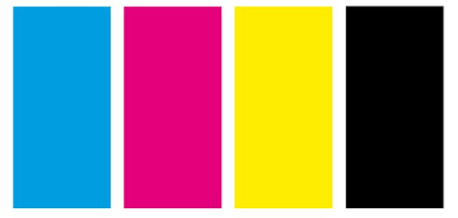
Image courtesy of Vispronet
How it works:
- CMYK works by combining these four colors in different amounts to create a wide range of hues and shades. Cyan, Magenta, and Yellow are subtractive colors, meaning they absorb light.
- Combining these colors in varying degrees of intensity not only creates additional colors, but when Cyan, Magenta, and Yellow are combined together in their fully saturated form, they absorb so much light that the resulting color is a dark gray.
- The separate Black is added to enhance contrast and create darker tones.
- The numbers that can be manipulated to create a wide array of colors are represented in percentage, so C100 would be 100% Cyan, while C10 would be 10% and would be a very light blue.
Pro Tip: To illustrate how CMYK works, if you were to print M100 (100% saturated black), the result would be essentially a dark gray.
To achieve what is called a “rich black,” adding in C, M, & Y would result in a much more saturated, dark black color. The exact ratio for a rich black range based on the ink and equipment used, but usually falls between a 50%-75% mix of the three colors along with M100.
Contrary to what you might think, a mix of 100% of all four colors doesn’t necessarily make it better and can result in too much ink coverage.
When to use CMYK:
CMYK is primarily used for any print design projects, as the medium is ink, not light. Which leads us to…
RGB Color Model for Digital Design
RGB stands for Red, Green, and Blue. Unlike CMYK, this color code is used for digital design projects that will be viewed on screens or displays. This makes it a key part of RGB color design for creating visuals across digital platforms.
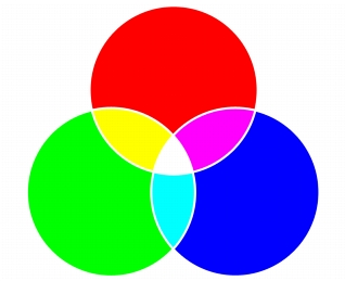
Image courtesy of Corel
How it works:
- RGB works by combining these three colors in different amounts to create a wide range of colors. Red, Green, and Blue are additive colors, meaning they create light when combined. The more of each color is added, the brighter the resulting color will appear.
- The scale for RGB color is from 0 (no light) to 255 (full saturation). While that may sound like an arbitrary number, it is based on the technology behind the delivery method of electronic screens. Rather than a physical medium like printing ink, the medium for RGB is light that is controlled by data.
- Without going into a computer science lesson here, the way computer computation works requires a certain amount of data (8 bits) to display Red, Green, or Blue. As each value of each color has the possibility to be one of 256 colors, since 0 counts as one of the values, the result is a total number of over 16 million color combinations.
When to use RGB:
RGB is ideal for digital design projects such as websites, social media graphics, and online advertisements, video production. Basically, anything that is being displayed on a screen.
Pantone (PMS) Color System for Brand Consistency
Pantone, or PMS (Pantone Matching System), is a standardized color code system used for branding and product identities. It consists of over 1,000 unique colors, each with its own designated number, making it essential in pantone for graphic design when consistency is critical.
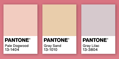
Image courtesy of Pantone
How it works:
- Pantone is a company that quite literally sets the standard. Colors are created by mixing 18 basic colors in extremely precise amounts. This allows for consistent and accurate color reproduction across all materials and mediums.
- Compared to color reproduction in a CMYK printer, variations in the ink, in the press, and even the work of the press operator can lead to inconsistent results. Utilizing the Pantone system is the best way to ensure that colors are as accurate and consistent as possible.
When to use Pantone:
Pantone is commonly used in branding, packaging design, and product identities. It ensures consistent color representation across various marketing materials and helps maintain brand recognition.
Editor’s Note: Years ago, while working in the marketing department at a newspaper, I learned that we had a large container of a specific orange Pantone ink that was used exclusively for Home Depot ads.
HEX Color Codes in Web Design
HEX color codes are a standard way of defining colors in web design. Written as six-digit combinations like #1A73E8, they represent specific values of red, green, and blue (RGB) in a format that browsers can easily interpret.
Because HEX codes are precise and universally recognized in digital environments, they play a key role in maintaining brand consistency across websites, landing pages, and online platforms. When the same HEX code is used, the color will appear consistent regardless of device or browser (within reasonable display limits).
HEX is especially useful in front-end development, where designers and developers rely on exact values to ensure that designs are translated accurately into live websites. In short, HEX codes help bridge the gap between visual design and technical implementation, ensuring your brand looks consistent online.
RGB vs CMYK vs HEX vs Pantone: Key Differences
Different color systems serve different purposes, and understanding when to use each one is essential for effective web design.
RGB (Red, Green, Blue) is used for digital displays. It’s an additive system where colors are created using light, making it ideal for websites, apps, and video content.
CMYK (Cyan, Magenta, Yellow, Black) is used for print. It’s a subtractive system based on ink, making it the standard for brochures, packaging, and other physical materials.
HEX is a simplified, web-friendly version of RGB, used primarily in coding and web design for precise color control.
Pantone (PMS) is a standardized color matching system used when exact color consistency is critical, especially in branding and product design.
As a rule:
- Use RGB/HEX for digital
- Use CMYK for print
- Use Pantone for strict brand consistency
Choosing the correct system ensures your colors look accurate in every medium.
The Interplay Between Different Color Codes
Understanding the interaction between different color codes and their respective contexts (print vs. digital, branding vs. web design) is crucial for maintaining a consistent brand image.
For example, using CMYK on a printed piece will get you close, but when it really matters, going with Pantone will ensure consistency and avoid negatively impacting the brand’s overall identity and recognition.
Tips for Choosing the Right Color Code for Your Brand Designs
It is essential to remember that each color code serves a specific purpose and is designed for different applications. Here are some tips to help you choose the right one for your brand designs:
- Familiarize yourself with the color codes and their respective properties: Understanding how each code works can help you determine which one will best suit your project.
- Consider the intended use and medium of your design project: Is it for print or digital? If print, how crucial is color consistency in this application?
- Keep branding in mind: Choose a color code that will ensure a consistent representation of your brand’s colors across all platforms.
- Test and compare different options: If possible, test out the colors in different codes to see which one offers the most accurate representation for your project.
- Test colors on multiple devices to ensure consistency: It is essential to test how your colors appear on different devices and screens, as they can vary in color calibration. It’s too much to get into here, but suffice it to say that a monitor can be complicated, and the vast majority of screens are never checked or corrected for color reproduction once they leave the factory.
- Consult with printing professionals or web developers: If you are unsure about which color code to use, don’t hesitate to seek expert advice from professionals in printing or web development. They will be able to guide you toward the best option for your project.
Common Mistakes in Using Color Codes
- One of the biggest headaches in production is “color drift.” It usually starts when someone designs a masterpiece in RGB and sends it straight to the press without converting to CMYK. The result? A vibrant digital design that comes back from the printer looking dull, muddy, and inaccurate.
- Another silent brand-killer is inconsistency. When you use “close enough” values for your brand colors across different platforms, you aren’t just changing a shade; you’re weakening your brand identity. Over time, those small variations between a social post and a physical banner become glaringly obvious to your audience.
- We also see designers ignore color profiles entirely. High-intensity, overly saturated colors might look “electric” on a backlit LED screen, but they simply won’t translate to paper. In the print world, relying on 100% black (K100) for large areas is a trap—it ends up looking like a dark charcoal gray. To get that deep, professional finish, you need a “rich black” mix. Similarly, if you skip Pantone matching when exact precision is required, you’re essentially gambling with your brand’s reputation across different materials.
Avoiding these technical pitfalls isn’t just about being “picky”—it’s the only way to maintain a professional, cohesive visual identity that people actually trust.
Best Practices for Maintaining Color Consistency
- To ensure consistent branding, start with a clear brand style guide that includes HEX, RGB, CMYK, and Pantone values for every core color.
- Always design in the correct color mode—RGB for digital and CMYK for print—to avoid unexpected shifts. It’s also important to test designs across different devices and, when applicable, print samples before final production.
- Using calibrated monitors helps ensure that what you see on screen is accurate. Additionally, always stick to approved color codes instead of manually adjusting shades.
Finally, work with reliable vendors and printers who understand color management. Consistency depends not just on design, but also on execution.
Why Professional Expertise Matters in Color Management
Color management is about more than just picking attractive shades; it’s a technical discipline that requires precision. An experienced designer understands the science behind how HEX, RGB, CMYK, and Pantone values interact across different environments. Professional expertise ensures that a color doesn’t just look good in a design file, but translates accurately to the real world.
Navigating these color codes is where expertise becomes an asset. A professional team prevents the costly mistakes that happen when color profiles are misinterpreted or conversions are handled incorrectly. When your visuals remain cohesive, from your website to your physical packaging, it builds a level of brand recognition that DIY methods simply can’t replicate.
Working with a skilled team like Ilfusion provides access to a refined process and the technical oversight needed for high-quality results. We take the guesswork out of color codes, providing you with a polished visual identity that builds stronger brand recognition.
Is your brand’s color consistency where it needs to be? Let’s ensure your visual identity is working as hard as you are. Contact us today at 888-420-5115, or reach out at creative@ilfusion.com to discuss your next project.