How to Use the Golden Ratio in Graphic Design
 April 19, 2024 | By Ilfusion Team
The Golden Ratio is a mathematical principle that has been used in a variety of fields throughout history, including art, architecture, and design. It is also a foundational element found all over the natural world, including plant life and animals, such as the shell of a nautilus.
In graphic design, particularly, the Golden Ratio is a powerful tool to create visually appealing and harmonious layouts. It isn’t obvious why this natural phenomenon influences our perception of design, but knowing that it does offers us useful insights. This blog post will explain what the Golden Ratio is and how it can be applied in graphic design effectively.
What Is the Golden Ratio?
The Golden Ratio, also known as the Divine Proportion or the Golden Mean, is a mathematical ratio represented by the Greek letter Phi (Φ) and is approximately 1.618:1.
This number isn’t arbitrary but is derived from a sequence of numbers known as the Fibonacci series (0, 1, 1, 2, 3, 5, 8, 13, and so on). The ratio of each number and the previous number gradually approaches the value 1.618.
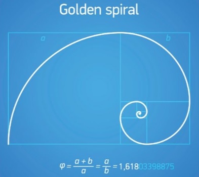
Image courtesy of Simplified
In graphic design, the Golden Ratio is used as a tool to create balanced and visually appealing compositions. It is believed that designs following this ratio are more likely to be perceived as harmonious and pleasing to the eye.
One practical example of using the Golden Ratio in graphic design can be found in logo designs.
Take, for instance, Twitter’s iconic blue bird logo. The proportions of the bird’s body, wings, and beak are all based on the Golden Ratio. This makes the logo more balanced and aesthetically pleasing.
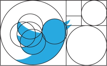
Image courtesy of Adomedia
How to Use the Golden Ratio in Your Brand Designs
Incorporating the Golden Ratio in your work can elevate your designs to a new level of visual appeal and balance. Here are a few ways to leverage this:
1. Layout Design (Print or Web)
Use the Golden Ratio to divide space in print or web design. The larger section can host the main content while the smaller one can be used for sidebars or supplementary information.
For example, in a website layout, the main content block can be 1.618 times larger than the sidebar. This ensures that the focus remains on the main content while still providing additional information for readers.
2. Logo Design
As mentioned earlier, logos can also be structured using the Golden Ratio. The divisions and proportions created by the Golden Ratio will guide you in sizing and placing different elements of the logo.
Each portion of the logo — text, images, or shapes — can be aligned with the Golden Ratio to create a well-balanced design. A rule of thumb is to put the most prominent element of the logo in the center, with other elements radiating outwards in a spiral pattern based on the Golden Ratio.
3. Typography
The Golden Ratio can be used to determine font sizes and spacing for typography in your designs.
For instance, you can use the ratio to decide how much space should be allocated between different lines of text or paragraphs. Another way to apply this is in determining the body text to headline size ratio, where the headline size is 1.618 times larger than the body text.
4. Color Palette Selection
The Golden Ratio can also aid in choosing a color palette for your designs. The ratio’s proportions can help determine how much of each color should be used to create a balanced composition.
For example, you can use the ratio to divide a color wheel into sections for different colors or to determine how much of each color should be used in a gradient. This ensures that your design has a harmonious and visually appealing color scheme.
5. Photography and Image composition
When applying the Golden Ratio to photography and image composition, the first step is to envision your image divided into nine equal rectangles, essentially forming a 3×3 grid. This grid is a practical representation of the Golden Ratio and is known as the Rule of Thirds.
The points where these lines intersect are strategic points of interest. By positioning the essential elements of your image along these lines or at their intersections, you can create a balanced composition that draws the eye through the image.
IMPORTANT NOTE: The Golden Ratio and the Rule of Thirds are not one and the same. While the Rule of Thirds is based on the concept of dividing an image into three equal sections, the Golden Ratio takes into account more precise proportions.
Golden Ratio in Brand Designs: Is It a Strict Rule?
The Golden Ratio is a tool for you to use in design; however, it is not a strict rule. You can always deviate from it to serve the specific needs of your design project.
A beautiful and effective design is not just about following a formula; it also requires creativity, experimentation, and individuality.
Use the Golden Ratio as a guide to create visually appealing and balanced designs, but don’t be afraid to break the rules and add your unique touch.
Create Visually Appealing and Effective Brand Designs
The Golden Ratio is but one of the many tools available to graphic designers. It is a useful concept to understand and implement in your design process, but it should not be the only factor influencing your work.
If you need any help or advice with your brand designs, don’t hesitate to consult with a professional graphic designer. Our design team at Ilfusion has the tools, expertise, and creativity to bring your brand designs to life.
Call us today at 888-420-5115, or send us an email at creative@ilfusion.com to get started!