Creative Logo Design Tips and Ideas for Businesses
 October 11, 2017 | By Ilfusion Team
Your business logo plays a key role in establishing your brand identity. It is one of the frontliners for your company, the very first thing that people see. One look at your logo and your customers can get an idea about who you are as a company and what you do. A logo can serve as a visual representation of your business, even when words can’t. This is why designing a creative and effective logo is paramount for all businesses.
Many companies struggle with creating a company logo, whether it’s a startup business or an established company going through a rebranding process. Here are six creative logo design tips and logo design ideas for businesses to help you get started.
1. Establish your company’s identity
You can’t create a representation of your brand when you don’t even know what you’re actually representing. A crucial step when creating your brand name logo is to establish your company’s identity.
Identify who you are, your target market, your products and services, and what you represent. It also helps to determine your company’s core values as these set the tone of your company’s character. This way it’s easier for your designers to come up with logo design ideas that clearly reflect who you are as a company.

BMW’s logo uses an effective strategy for establishing their brand identity. They used the tactic of leveraging their company history to create their logo. It tells the story of their humble beginnings back in 1917, when they originally focused on aircraft engines. A year after their launch, they were forced to cease the production of aircraft engines and, as a result, they shifted their focus to motorcycles and automobiles. Their present-day logo pays homage to their heritage: the four quadrants represent a white airplane propeller, with the blue background depicting the sky.
2. Study your competition
Getting to know your competitors can help you gain insight into your target industry. Studying your competition isn’t about copying what they’re doing; it’s about finding out what your competitors haven’t done yet.
It’s a good idea to explore unchartered waters in logo design. If you’re a pastry shop and every other pastry shop you come across is using a baker’s hat in their logos, it doesn’t mean you have to follow suit. Don’t be afraid to go against the norm. You need to experiment if you want to stand out from the rest.

The WinePlace logo design came up with a clever way to incorporate two pictures in one concept. Their logo looks like a thumbtack which suggests a “place,” and also looks like an upside down wine glass. The concept is original, witty, and goes beyond the cliche.
3. Take your time when designing
Often, businesses rush through the design process and go with the very first option they come up with. Designing a logo takes time: you need to put a lot of thought into your strategy, your brand identity, the colors, the symbolism, and so much more. Your brand logo is a long-term commitment. You’re likely to stick with it for a long time before you decide on rebranding, so make sure you get it as close to perfect as possible the first try.

Rushing through the design process without giving careful thought to all design elements could result in a badly designed logo, or worse, a logo that somehow looks like something else. You may have already seen many logo design failures, just like the logo above—once you see it, you can’t unsee it.
4. Strategize your color palette
The color of your logo speaks volumes for your brand identity. A color palette is one of the most important design elements as it sets the tone for your brand message. There’s truth behind color psychology. Choosing the right color(s) can evoke the right feelings when customers see or hear your brand name, which is instrumental when it comes to effective marketing. In fact, 90% of people’s assessment of a brand is based on color.

Take McDonald’s logo for example. They used a combination of red, yellow, and white, all of which stimulates excitement. Red is also a favorite among the food industry because it’s a color associated with enhancing human metabolism. If you play with the colors and use green or magenta instead of red, it just doesn’t entice the same feeling as the original palette.
5. Make your design ownable
In marketing, it’s not enough to just stand out from the rest of the crowd; you need to make a lasting impact. Your logo design can help you achieve that lasting effect when you make your logo ownable to your brand. Ownable means that your logo is uniquely recognizable. Your customers should be able to immediately associate a certain font or color with your brand the first moment they see it.

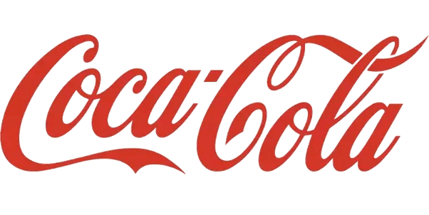
Coca-cola made use of a customized font style that’s immediately recognizable as their own. Even if you replace the words with something other than “Coca-cola,” using the same font style will still remind people of Coke.
6. Keep it simple
When you put too many elements in a single logo, the design looks cramped and could confuse your audience. Logos are often minimized to tiny sizes, especially when you place your logo on business cards and company giveaways, such as ballpens and caps.

Keep your logo design as simple as possible. Using lots of negative space can help your audience focus on the logo itself, which makes for a cleaner design. Simple logos such as Apple’s prove to be one of the best logos in the business world that’s both powerful and easily recognizable.
Designing a business logo requires specialized skills, knowledge, and a considerable amount of experience. Hiring a professional designer can help you achieve your branding goals. Professional designers ask the right questions, provide insight to your concept, and have the skills required to create an effective brand logo.
If you want to know more about brand logo design, or for Ilfusion to help you with your logo design needs, give us a call at 888-420-5115, or send us an email creative@ilfusion.com.

