March 11, 2014 | By:

Making It All Fit All

Take a look around the next time you’re in a public place and notice how many people are staring into their cell phones, tablets or laptops. The majority of these people are probably browsing websites or perusing social media, and the amount of people using their mobile device to get on the web is continuing to rise. If you’ve ever had to navigate a website that isn’t built for a mobile device, you know it can be an aggravating experience. A company that doesn’t have a website that is compatible with a broad range of mobile devices can lose business through mobile visitor irritation, and in exchange take their business to a company that has a website they CAN easily navigate from their mobile device.

A few years ago the only available solution to this issue was to build two separate websites, a desktop version and a mobile version. As a graphic designer working at a marketing firm, I’ve watched the industry struggle to keep up with new devices and screen sizes ranging from the iPhone/Android/Blackberry to Kindle/iPad and more. Creating a different website version for every single new device that comes to market would be expensive, unrealistic and pretty much impossible.

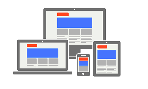
Now we can eliminate the need to create a different website version for different devices due to the creation of responsive web design. Responsive web design is an approach to website development in which the web page responds the form factor and resizes itself based on the browser size or mobile device it’s being viewed on. It adjusts the text, images and other content to fit the space using flexible grids and fluid layouts.

Responsive

In order to create a design that works as a responsive website, my number one rule is “simplicity”. I have to constantly think, “how will this break down on smaller screen sizes and mobile devices?”. As I am designing the web comp, I’m always having to identify non-essentials and stay away from unnecessary clutter. For example, overlapping cut out photos, fades, textures that aren’t patterns, too many curves etc. A few things I keep in mind when designing for responsive are:

1. The Way Things Work is Crucial
Things like rollovers do not work the same on touchscreen devices like tablets and cell phones. Gestures like swipe, pinch and slide are what work best since they have become a natural movement for users. What I usually do is design rollovers or arrows for mouse-based and then use gesture equivalents for touch screens for a more successful experience. I can’t just design something that looks pretty for the sake of being pretty anymore, I always have to think about how or if it will work when it breaks down.

2. Forget About Pixel Perfect
As a designer, I was trained to think strictly in pixels for web, but for responsive design, I have to think in percentages. I have to make the design as flexible as possible and keep in mind that every pixel is not going to end up looking the way it does on the static web comp. Things will change, move and resize based on browser size or mobile devices. I have to let go of my nitpickiness to allow the site to act correctly on various screen sizes.

3. I Can’t Simply Hand Over a Desktop Comp to the Developers and Call it a Day
There has to be some kind of explanation of how I want the comp to break down. In order to do this efficiently, I usually build three comps, one for desktop, tablet and cell phone, so that the developer can easily see the best way for the comp to break down without having to guess. Then I show other website examples I have found and explain the functionality I had in mind for the site. For example, if I want the banner to expand wall-to-wall no matter what the browser size, I will search existing examples to show the developers.

Although responsive web design is the perfect current solution to create a better user experience for all of the platforms and screen sizes out there, it probably will not be the final answer to the endless changes that the mobile world holds. For now, it is the best and most efficient approach to get the most out of your website!

If you’d like to learn more about responsive websites and how Ilfusion can help you get the most out of the web, call 888.420.5115 or email [email protected].

Tags: , , , ,

Categorized in: ,

Featured Articles

February 1, 2018 | By: Ilfusion Team

How To Start an SEO Campaign in 6 Steps

Starting a Search Engine Optimization (SEO) campaign can be tricky for any digital marketer. How do you begin? What is the most important element to implement? How do you know if it’s working? Don’t be overwhelmed, though. Starting an SEO... view more

September 26, 2017 | By: Tinny

5 Signs You Need to Hire a Marketing Agency

Marketing is a crucial part of your business strategy. It’s what keeps the gears turning and the driving force of your company’s sales. For small businesses, marketing is important in getting the word out there that your company exists and... view more

September 21, 2017 | By: Tinny

Key Advantages of Video Marketing for Your Growing Business

There has been a rise in the use of mobile devices to access the internet, and there are no signs of it slowing down anytime soon. In this era where most people thrive on living on the go, video marketing... view more

September 13, 2017 | By: Tinny

5 Things You Need to Know: Image Optimization for SEO

If you’re a company whose content strategy relies on images, or if your business blog is image-heavy, it’s high time for you to think about optimizing your images for SEO — if you haven’t done so already. While there isn’t... view more

August 2, 2017 | By: Tinny

Tips on How to Choose the Best Keywords for Your Website

When you have an SEO or PPC campaign, it all starts with one basic element: keyword research. Keywords are the driving force that enable web crawlers and indexers to find your page through the throngs of websites in the world-wide... view more

July 26, 2017 | By: Tinny

Top 3 Search Ranking Factors You Should Know About

Landing on the first page of Google’s search engine results is one of the ultimate marketing goals of many website owners. While Google is keeping mum on what exactly gets you to the top of their SERPs, there are factors... view more

June 28, 2017 | By: Tinny

The Importance of Social Media in SEO

Nowadays, social media has inarguably become an indispensable tool in any marketing strategy. SEO, of course, is also one of those tools that have evolved with the many trends and changes that has occurred through time. This leads marketers to... view more

April 27, 2017 | By: Tinny

5 Ways to Dominate Google’s Search Results in 2017

Here’s how to place your website at the top of search engine results. Creating a website that doesn’t rank well in Google’s search engine results page (SERP) doesn’t translate well to your overall business effort. In recent years, Google has... view more

July 2, 2015 | By: The Conductor

Let’s talk about “The Fold”

We hear it a lot; client feedback that is focused on what content is and is not “above the fold”. To be perfectly honest, this old newspaper term can be a cause of frustration when it comes to good user... view more

June 3, 2015 | By: The Doctor

The Turbit

This crazy ol’ world of ours is spinning faster and faster everyday. Not literally, as we would all be slung to our spacey-doom. I mean figuratively we are all moving more quickly and filling every moment with some bit of... view more

May 6, 2015 | By: Ilfusion Team

How Your Website Can Survive Mobilegeddon

Think your website is mobile friendly? Think again. Google’s new functionality changes have created a frantic need for websites to be optimized for mobile. Mobilegeddon is upon us, and your website could be at risk. See infographic below.

April 23, 2015 | By: El Jefe

Website Cost: A Day at the Ballpark

A question that I get on a regular basis (read: every day) is, “How much will my new website cost?”. To which I typically say something like, “Well, that varies based on the amount of work that’s required to complete... view more

April 7, 2015 | By: The Inventor

Are you a Webspammer?

SEO practices are very different today than how they were even just a few years ago. The number one key to ranking well in search engines today is to create unique quality content. First post it on your website or... view more

March 25, 2015 | By: Ilfusion Team

Social Media Happenings

Ilfusion loves to bring you news on the newest social media functions and trends. Recently, there have been three major happenings in the social media world. Meerkat, a new app that has risen to fame due to the 2015 music... view more

March 12, 2015 | By: The Conductor

The Big Picture

Whether you’re laser-focused on a specific project, or taking a comprehensive approach to your marketing efforts, one aspect doesn’t change: always look at the big picture. Companies often shop at least a few agencies when they’re considering engagement with an... view more